As the world grapples with the Covid-19 pandemic, one message is clear – good personal hygiene, in particular regular handwashing with soap and water, is critical to help slow the spread of the virus.
There are also many other important measures including isolating if you or someone in your household have symptoms, general social distancing measures and protecting the vulnerable. However these are beyond the scope of this blog.
Washing with water alone reduces germs by 50% – but adding soap reduces them by 80%. But how can you make sure a handwashing message is actually received and acted upon? People are not as good at handwashing as they think – so the benefits of handwashing will only be harnessed if everyone actually starts doing it properly.
Many governments and health authorities have already created posters and infographics to encourage people to thoroughly wash their hands. We decided to test some of these in order to identify which were most effective.
Between 12 and 17 March, we ran an online experiment involving 2,600 UK adults which tested 7 posters from the UK, Singapore, Italy, South Korea, Spain, Taiwan, and the World Health Organisation. All 7 designs showed people how to wash their hands in a procedural, step-by-step way. For the purposes of the test we removed identifying logos and brands from each poster, and translated the designs from Taiwan, Italy and Spain into English.
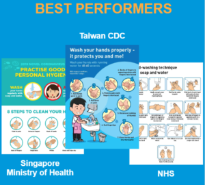
We found 3 designs did particularly well in terms of people remembering their key messages, rating them positively, and being more likely to say they would thoroughly wash their hands more often after seeing them.
These top performers all used bright infographic designs with a step-by-step procedure for thorough hand-washing prominently displayed without too much accompanying text.
They are shown below – they were created by the Taiwan CDC, Singapore Ministry of Health, and the UK NHS. We congratulate them all.
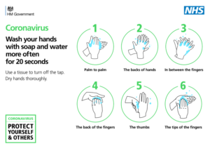
The good news for the UK is that the government has just launched a new ‘how to wash your hands’ infographic. This new design was released after we started our experiment, which is why it wasn’t included. However, it does exactly follow the best principles we identified – a bright, clear design with minimal text and an emphasis on the step-by-step procedure. The addition of the ‘Coronavirus’ branding will likely make it even more effective at attracting people’s attention.
BIT is keen to continue sharing the best practices we identify in our ongoing research about Covid-19. If you work for a government or public health organisation anywhere in the world, get in touch and we will send you our latest Covid-19 findings as we get them.